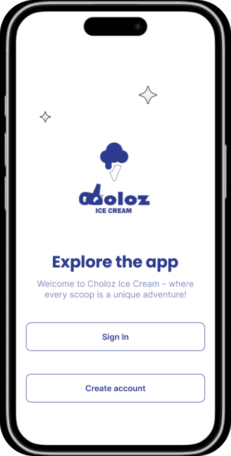
CHOLOZ
View High Fidelity
About the project
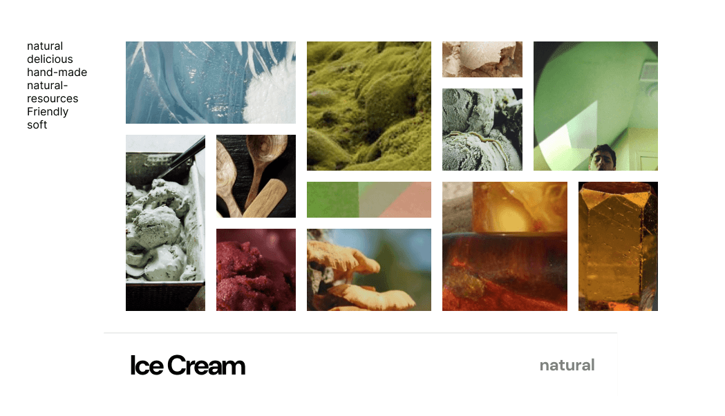
Moodboard
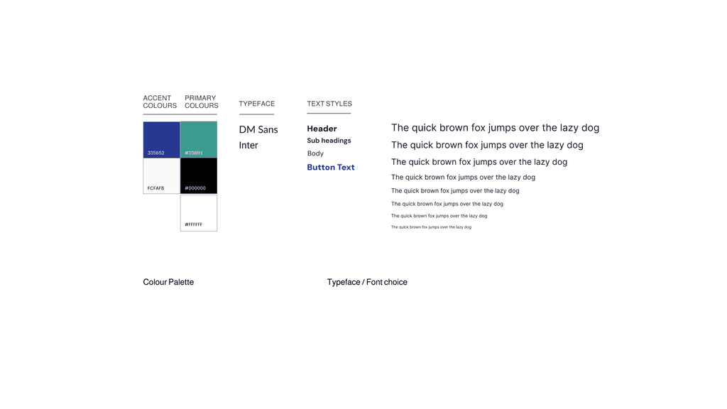
The moodboard is inspired by the core themes of creaminess, nature, and youthfulness—exploring elements, textures, and colors that reflect a fresh, playful, and wholesome brand identity.
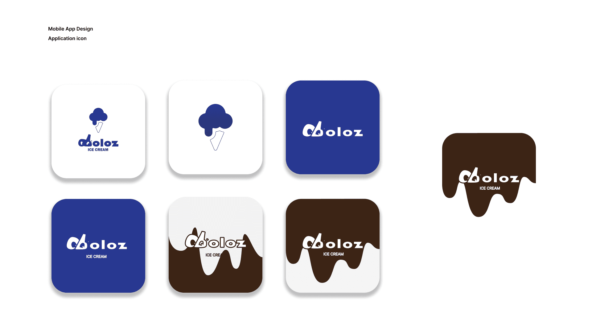
Mobile App Design
The mobile app icon design is inspired by the texture and patterns of ice cream, incorporating the brand’s graphic motifs to create a playful and recognizable visual identity.
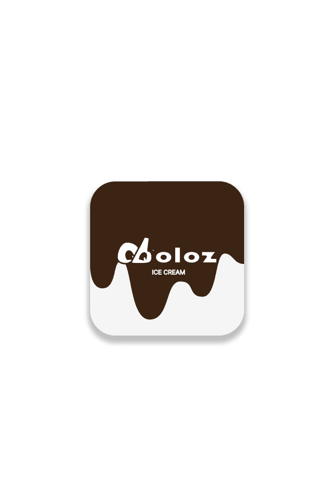
Application icon
The final design incorporates the brand’s main color and logo to ensure consistency and recognizability across all platforms.
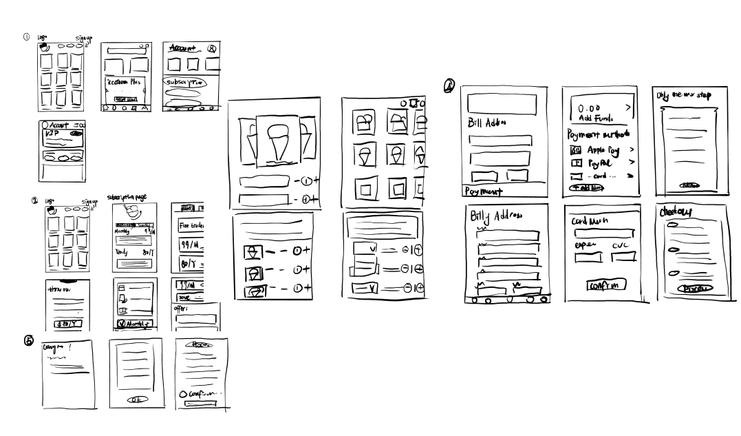
Sketches
- Playing with ideas
During the ideation phase, I conducted extensive research on various ice cream subscription platforms and sketched a range of features and components that could enhance the user experience.
Wireframe
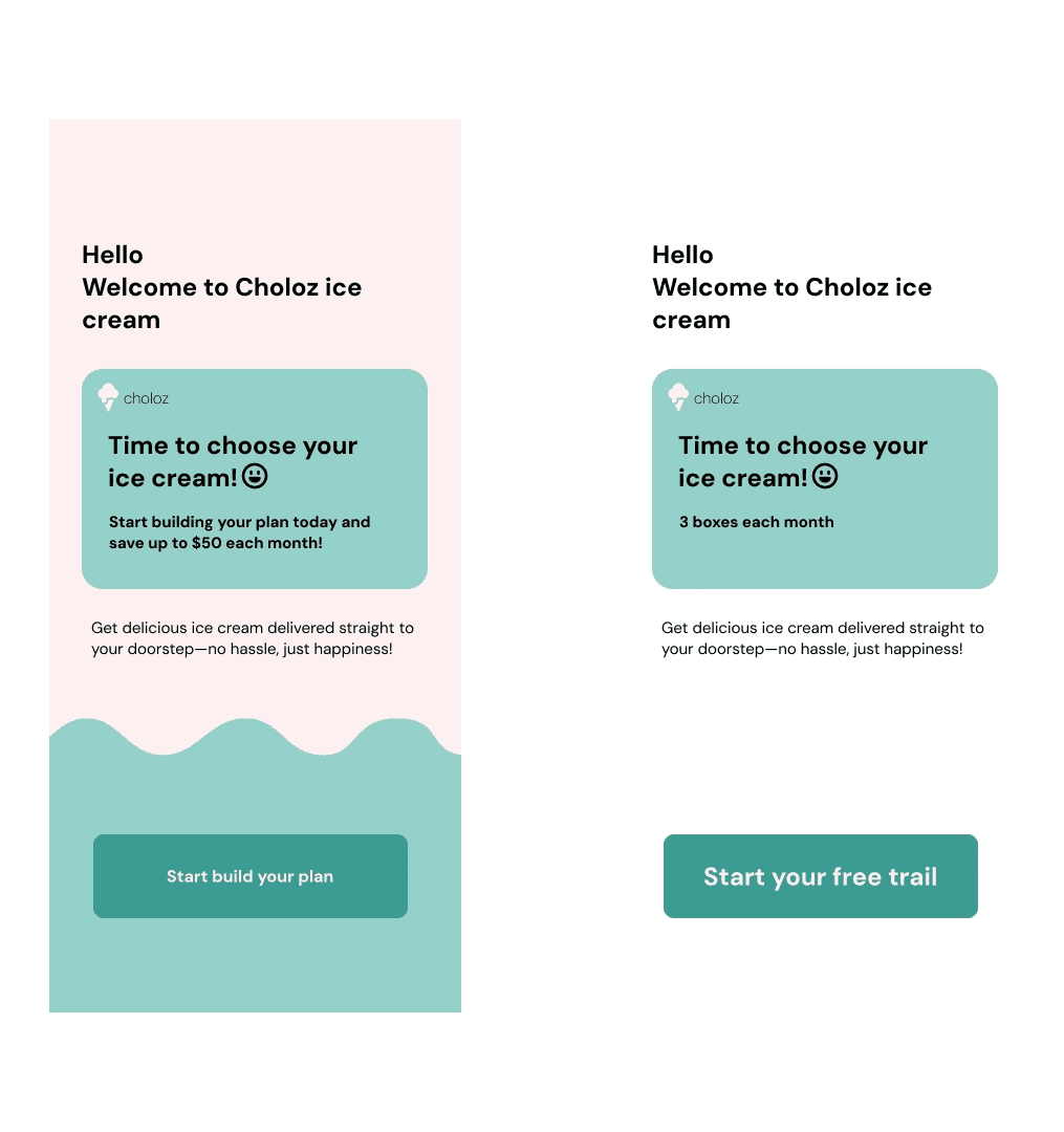
I began by digitizing my sketches into low-fidelity wireframes. Below is a comparison of key screens from two early design variations.
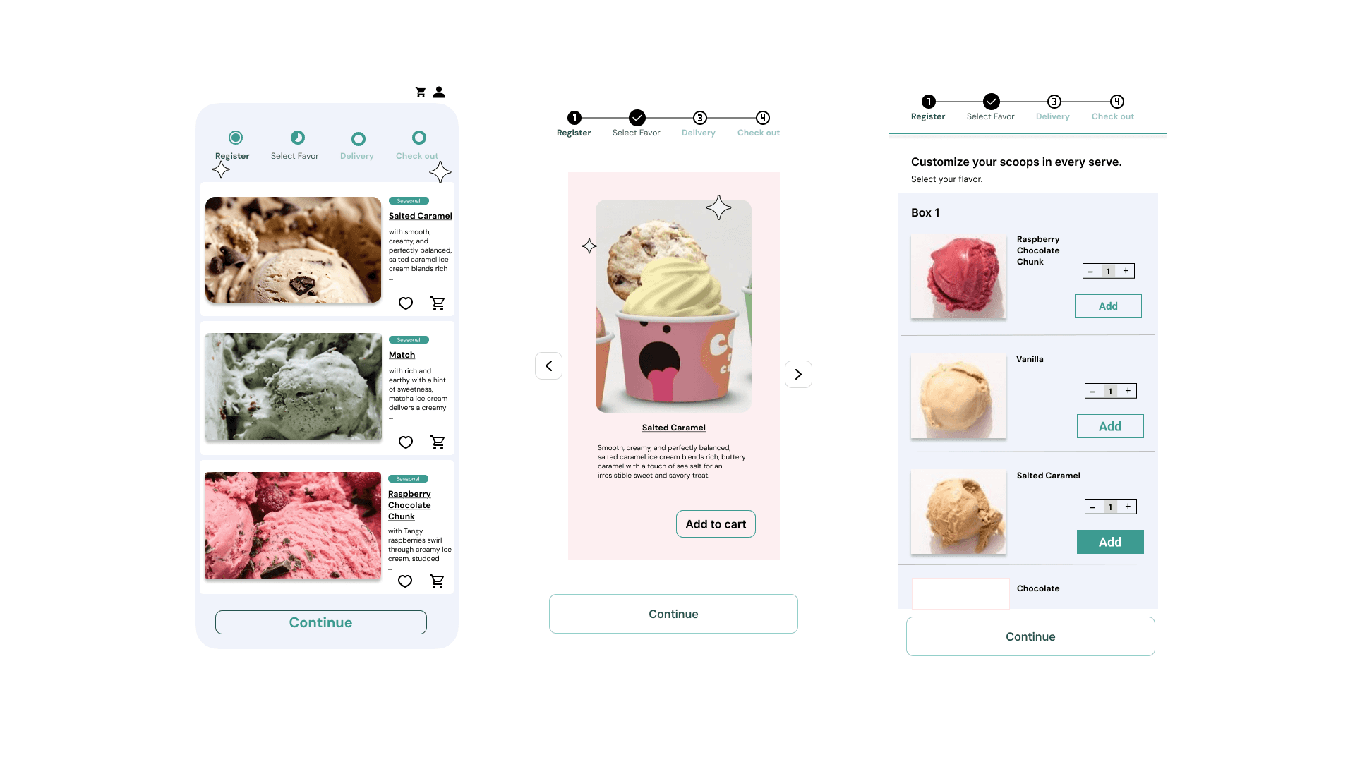
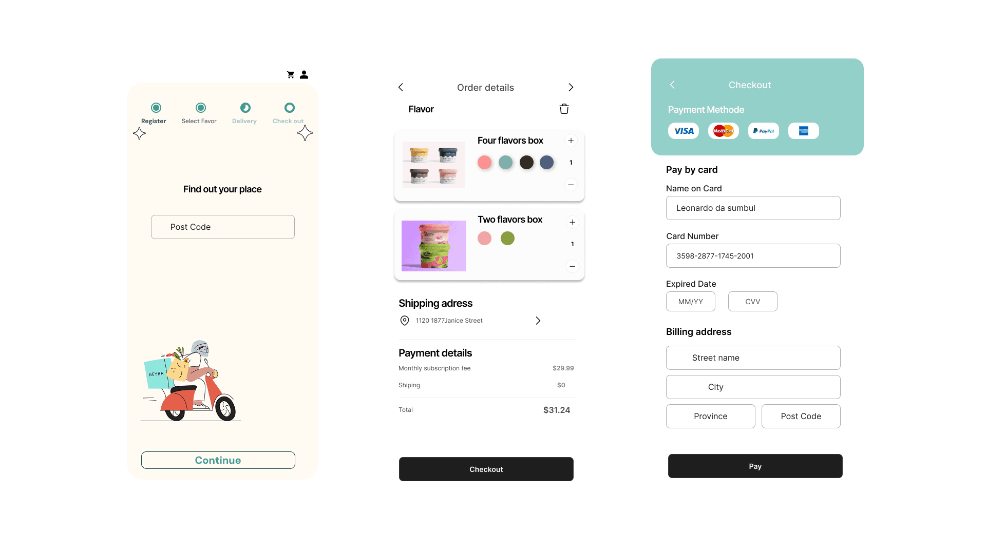
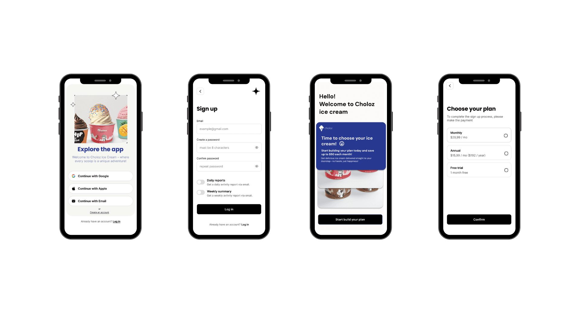
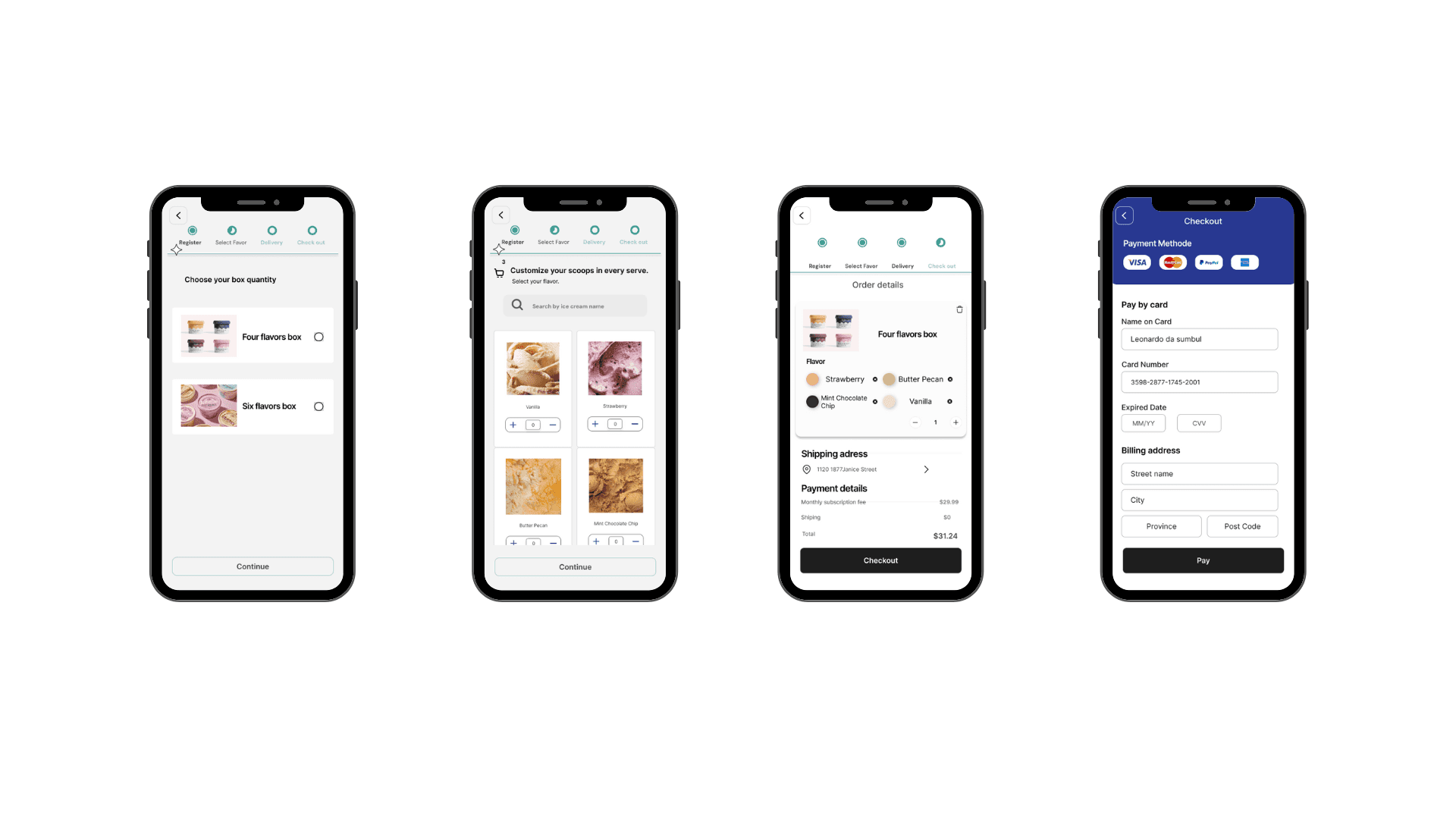
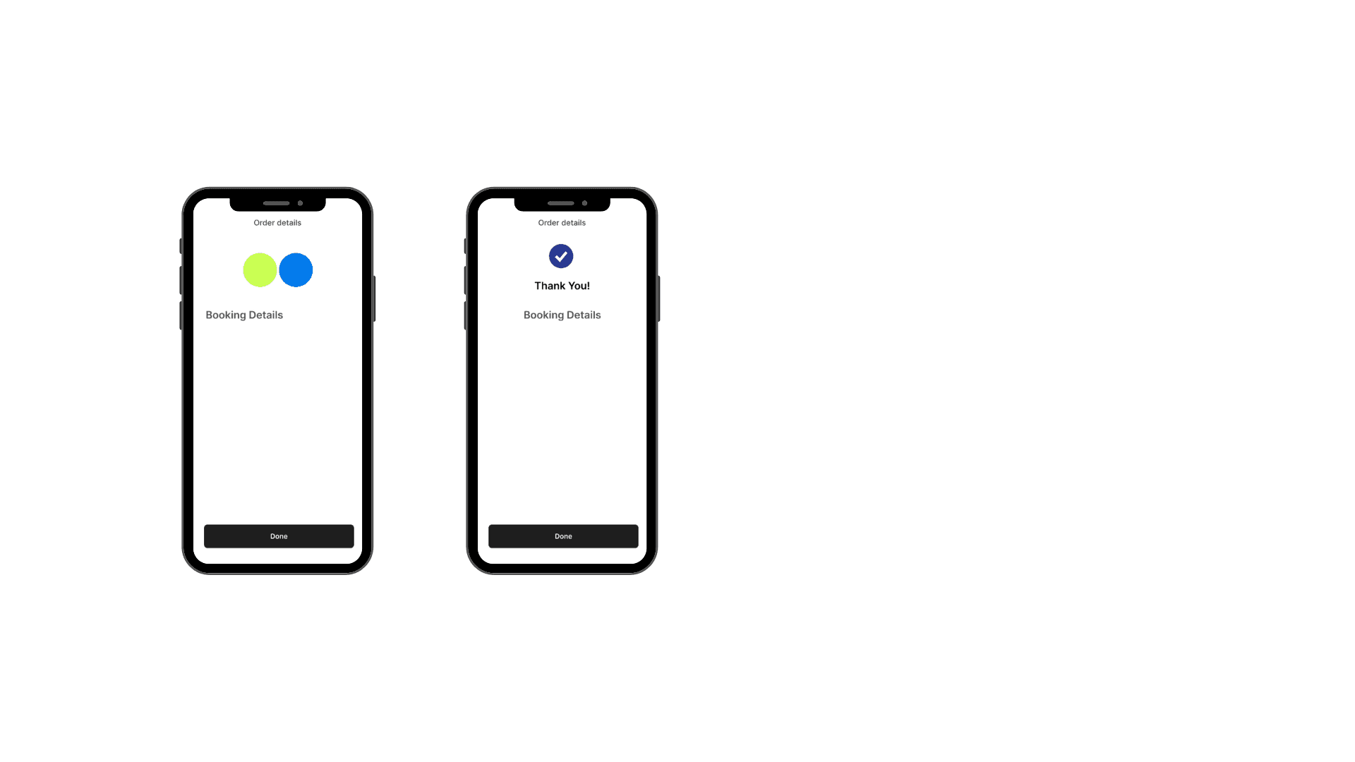
The subscription process
The primary goal is to design an effective and seamless subscription experience for the ice cream brand's mobile app.
Iteration
I conducted two different user testing eaching revealing usability issues with I then prioritied into solutions for next hifi prototype/
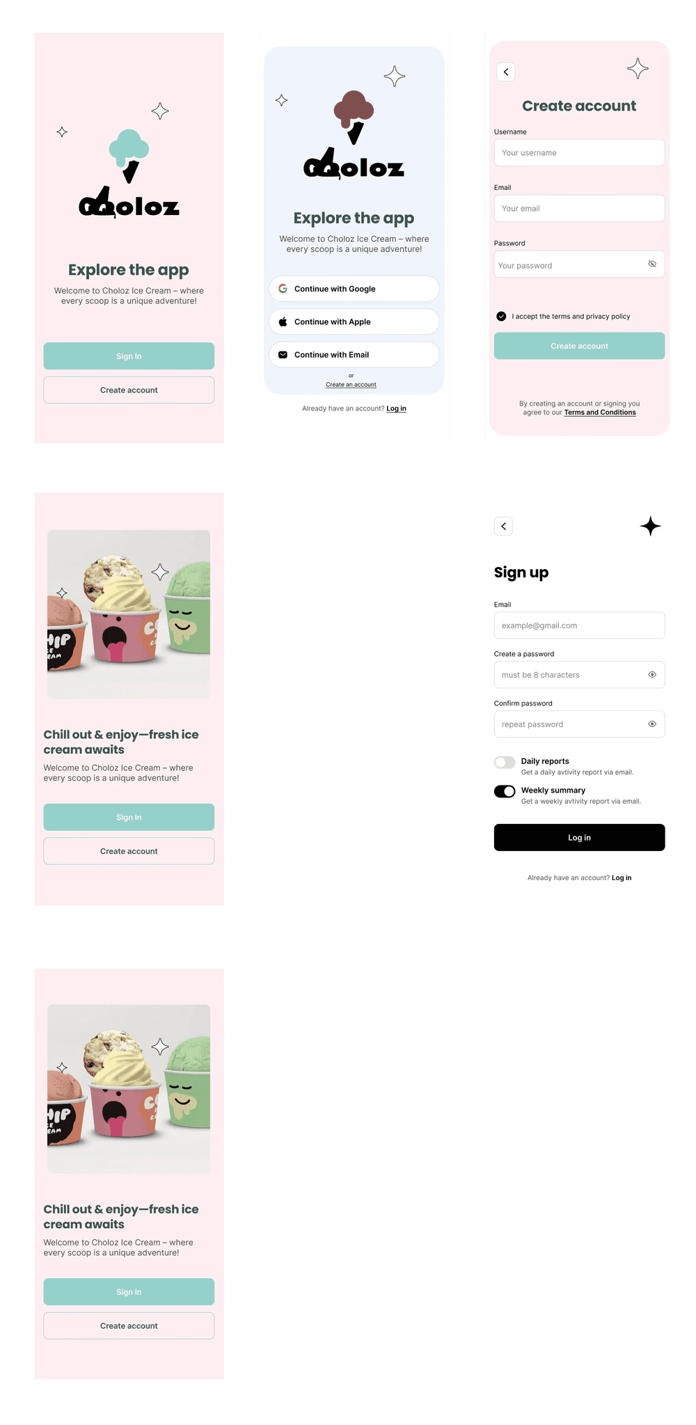
High fidelity
Making it real
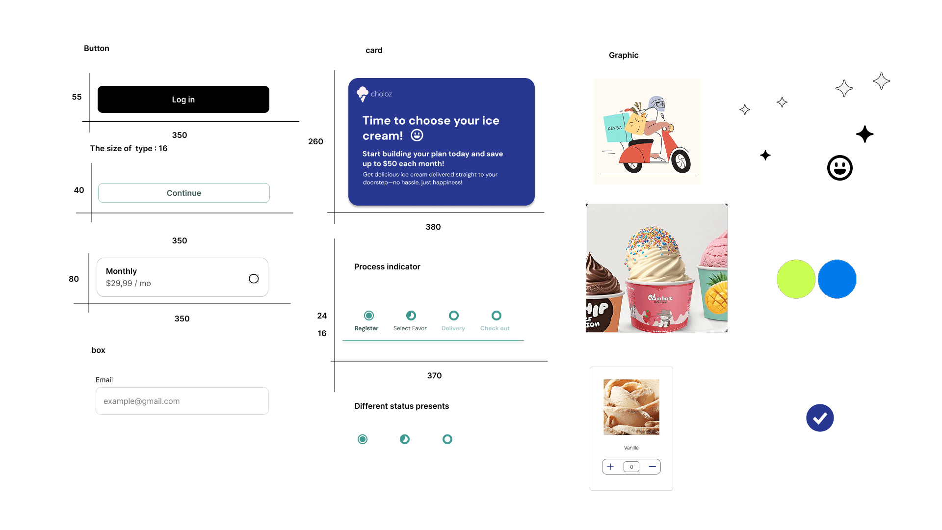
UI Library
While building my UI library, I applied the Atomic Design methodology to create a thoughtful and scalable design system. Below is a curated selection of components from the library.
Prototype
What I learned
Designing with emotion in mind.
This project taught me the power of storytelling in UX. By connecting donation amounts to real historical narratives, I learned how emotional engagement can enhance user motivation and create a deeper sense of purpose behind each interaction.
Small design choices, meaningful impact.
Working within a limited visual identity pushed me to focus on clarity, hierarchy, and accessibility. Simple tweaks—like button placement, language tone, or scroll behavior—had a significant effect on user flow and overall experience.
Balancing education and action.
I learned how to balance informative content with clear calls to action. Providing historical context without overwhelming users helped maintain momentum through the donation process while still honoring the richness of the site’s heritage.
View